Guidelines
Welcome to the SEGRO guidelines. This is our instruction manual and rule book on how the SEGRO brand must be communicated.
We hope you will find what you need here and that there is sufficient clarity to allow you to understand how to use the SEGRO brand. Should you need any further clarification, then please email brandguidelines@segro.com
01
Overview
Our purpose is to create the space that enables extraordinary things to happen.
SEGRO was founded in 1920. Whilst our history is fascinating, it is the business we have become today that is relevant for these guidelines.
Our purpose is to create the space that enables extraordinary things to happen. This is the essence of why we exist and it’s the driver that unites every single person at SEGRO. This is no fanciful claim – you will see how proud we are of our work and how it positively affects our customers and communities across much of our marketing and communications. It is the focus that allows people to emotionally engage with us. It is our point of difference. And it is central to how we think about ourselves.
Caption
Everything shown here has been produced or stored in a SEGRO facility.
We define ourselves as a creator brand archetype.
Our marketing and communications activity is designed to consistently and coherently deliver the message to all our audiences that SEGRO is a creator brand – in other words we are an enabler: helping others to succeed and, as such, a force for good.
Our ambition is to be the best property company.
As both a creator of exceptional buildings and an enabler of extraordinary things, our ambition is to be the best property company, and the partner of choice for our customers and other stakeholders.
02
Identity
Our purpose and values are well embedded in the business and form the basis of our workforce policies. They help to unify us and describe the core beliefs about how SEGRO does business. They are a universal language across our business and the countries in which we operate.
Logo
Master Logo
Scaling
SEGRO "O"
Exclusion Zone
To ensure that the SEGRO logo always appears clearly and is unobstructed, it is important to provide an area of clear space around it. The minimum exclusion zone is shown here and where possible this clear space should be increased to allow the logo to visually sit well in relation to other graphical elements. No other graphical object should appear within the exclusion zone area.

The logo should maintain a clear space equal to 0.5x (half the diameter of the ‘O’), around the entire logo.
Logo Placement
When placing the SEGRO logo in a page layout, it should
never be placed too near to the edge of a page, or bounding
area. This will maintain consistency through communications
as well as prevent any errors in cropping when items are
printed.
This guide shows the minimum amount of space required between
the logo and the edge of a page.

The logo should maintain a minimum space equal to X (the diameter of the ‘O’), between itself and the edge of any page, logo or object.
Usage Rules
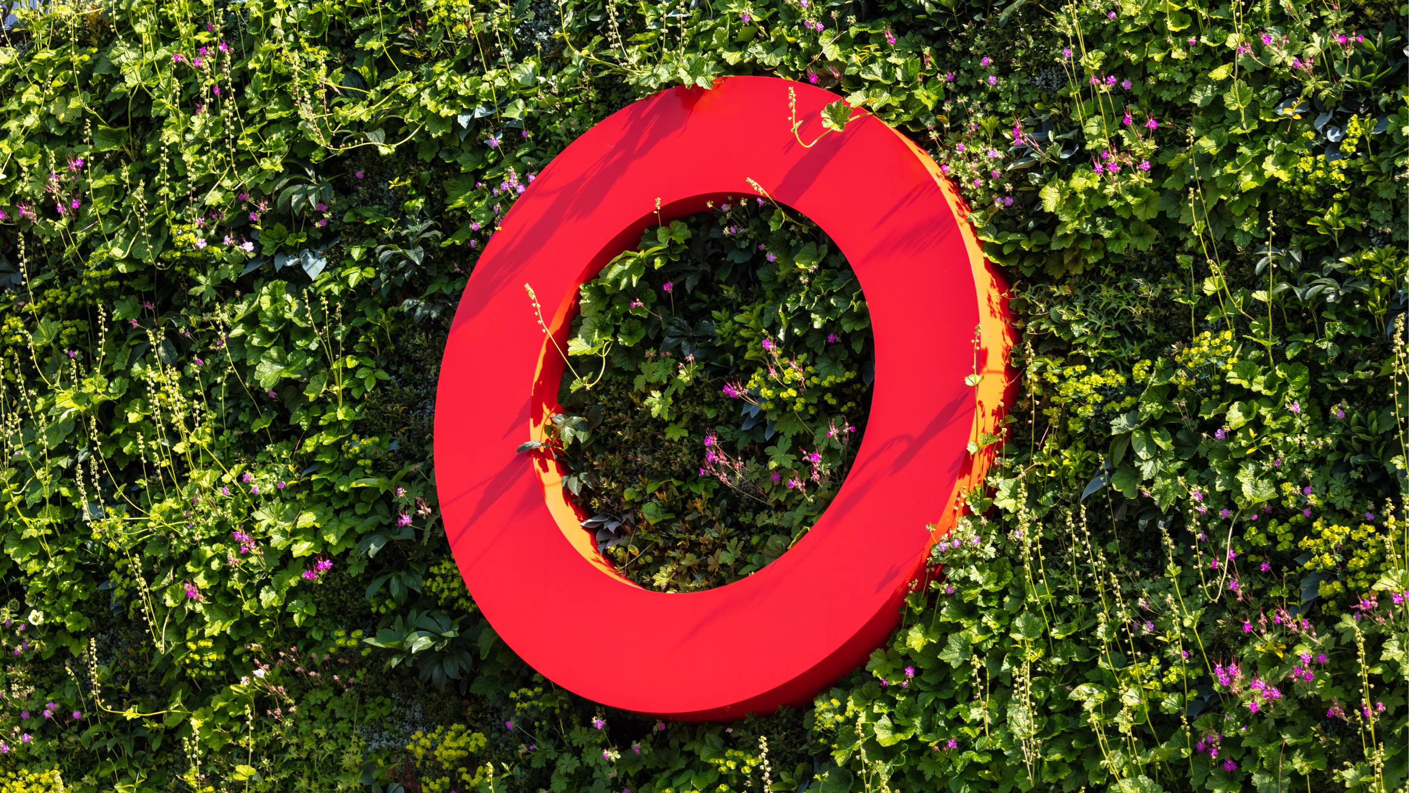
SEGRO 'O' Device
It is permissible to use the “O” of SEGRO in isolation as a brand marketing device providing:
- The wordmark “SEGRO” is visible within the same environment, unless when used for building signage. In that case the “O” can be used without the wordmark.
- It is used correctly - in Delta and the SEGRO red colour
- The space within the “O” remains empty. On no occasion must it be filled or partially filled with anything
- All uses of the red O should be approved by the marketing team via marcomms@segro.com or the local marketing team
Colour Palette
The primary colour palette underpins the SEGRO corporate style. These colours are used on marketing materials and all forms of communications.
Wherever possible, these colours should be printed using Pantone® spot colours. By using Pantone® colour references, this will ensure consistency throughout all materials produced. If spot colour is not possible, the CMYK breakdowns shown on this page should be used.
Primary colours
PANTONE
Black C
CMYK
30C 0M 0Y 100K
RAL
9005
RGB
44R 42G 41B
Hex
#000000

Click to copy HEX value
PANTONE
186C
CMYK
0C 100M 100Y 16K
RAL
3020
RGB
204R 23G 30B
Hex
#CC171E
Click to copy HEX value
PANTONE
9143C
CMYK
5C 5M 10Y 0K
RAL
1013
RGB
239R 235G 225B
Hex
#EFEBE1
Click to copy HEX value
PANTONE
Cool Grey 6C
CMYK
0C 0M 0Y 40K
RAL
7040
RGB
167R 169G 172B
Hex
#A7A9AC
Click to copy HEX value
PANTONE
Cool Grey 11C
CMYK
0C 0M 0Y 70K
RAL
7043
RGB
109R 110G 113B
Hex
#6D6E71
Click to copy HEX value
SEGRO BLACK
#000000
SEGRO RED
#CC171E
SEGRO BEIGE
#EFEBE1
SEGRO GREY
#A7A9AC
SEGRO DARK GREY
#6D6E71
Secondary colours
PANTONE
202C
CMYK
0C 100M 65Y 47K
RAL
3003
RGB
144R 0G 40B
Hex
#900028
Click to copy HEX value
PANTONE
7476C
CMYK
85C 49M 51Y 25K
RAL
6004
RGB
40R 93G 99B
Hex
#285D63
Click to copy HEX value
PANTONE
7468C
CMYK
85C 40M 25Y 2K
RAL
5019
RGB
23R 126G 160B
Hex
#177EA0
Click to copy HEX value
PANTONE
5493C
CMYK
43C 0M 14Y 21K
RAL
6034
RGB
115R 175G 182B
Hex
#73AFB6
Click to copy HEX value
PANTONE
5767C
CMYK
15C 0M 65Y 38K
RAL
6013
RGB
149R 157G 86B
Hex
#959D56
Click to copy HEX value
PANTONE
7531C
CMYK
0C 10M 27Y 50K
RAL
7006
RGB
148R 134G 113B
Hex
#948671
Click to copy HEX value
DEEP RED
#900028
FOREST GREEN
#285D63
BLUE
#177EA0
SKY BLUE
#73AFB6
OLIVE
#959D56
BROWN
#948671
Typefaces
We use two fonts for all our communications – Delta BQ Book and Graphik:
Delta BQ Book
Delta BQ Book
BOLD AND DIRECT.
Delta BQ Book is used as the typeface for the SEGRO logo. It is to be used sparingly as a display font in specific uses where our message needs visual emphasis and character (for example headlines, opening paragraphs, statements and text pull outs), and always as the primary focus of the design.

Do not use for body copy, or digital context where it may appear small, or any other use where it is not the primary focus of the design.

Suitable for large, bold headlines that emphasise occupier benefits, key campaign statements and any other messaging that needs to really stand out.
Only use capitals, not lower or title case!
Use only this single weight of the font.
Try it out for yourself:
Graphik
Graphik
Our purpose and values are well embedded in the business and form the basis of our workforce policies. They help to unify us and describe the core beliefs about how SEGRO does business.
Graphik is plainspoken and clear, used in corporate communications and general body copy.
Multiple weights are supported as required by layout.
Avoid using in all caps.
Try it out for yourself:
Fonts in Use
Here are some examples of both fonts in use:
Tone of Voice
Tone of voice (TOV) is hugely important in how we express ourselves: it helps set us apart, it helps build trust and it helps us influence. The chart below sets out how our ambition, purpose and values inform our voice:
Aspirational
To be the best property company.
We are unashamedly ambitious in our quest to be the best.
Use strong verbs and positive, affirmative sentences.
Be proud of our successes.
Use passive, apologetic and tepid language.
Creative
We create the space that enables extraordinary
things to happen.
We delight in creating positive change for our stakeholders.
Articulate the joy of being able to make positive change.
Become cliched or cheesy.
Honest
Say it like it is.
We are straightforward and do say it like it is.
Be truthful and direct
Use overly complicated language. Promise things that can’t be done.
Innovative
If the door is closed...
We are open to new ideas that will provide value to our stakeholders.
Convey the sense of our openness to change and growth.
Be pretentious or disingenuous.
Collaborative
Stand side by side.
We believe in teamwork and have a partnership attitude.
Be respectful and acknowledge the role of others.
Be self-absorbed.
Progressive
Does it make the boat go faster?
We challenge ourselves to continuously improve.
Show clarity and be precise.
Waffle on.
Farsighted
Keep one eye on the horizon.
We are intelligent professionals, who prepare for future challenges.
Use self-aware language. Be smart.
Be banal and cliched.
Photography
Our strong preference is always to use our own photography.
Occasionally, where we are definitely unable to do so, we
will consider using library photography, but only as a last
resort and where all other options have been exhausted.
SEGRO has an extensive library of both property/asset- and
people- photography. This is housed at our digital media
library (MySEGRO library) and access can be obtained through permission by
contacting brandguidelines@segro.com.
Image release forms should be completed for any footage that
contains people's features or identifying marks. SEGRO release
forms are available on request.
Asset photography
Property is our business and, as a consequence, how we present our properties is of huge importance. Ensuring high quality building photography is paramount therefore and the following represents essential advice when commissioning building photography for all properties.
Focus should be on relating the sense of place and purpose – ideally focussing on what the building enables rather than just showing space.
Avoid excessive retouching that pushes into misrepresentation. Adding or removing street furniture, changing the structure itself, and other such drastic changes are not allowed.
Retouching that removes or corrects minor blemishes and distracting detail (such as oil spills, litter, scuffs, etc) is fine.
Do not use AI generated images, unless with permission from the SEGRO Marcoms team.
View rules and suggestions
Focus on design elements of a building that showcase innovation and sustainability.
Focus on the extraordinary nature of what’s happening in the space: lifting the lid on what is happening in the building.
Consider who will be viewing the image, and what the potential positive and negative elements within the image are likely to be.
Keep verticals vertical and beware of converging parallels.
When possible, convergence should be eliminated as much as is necessary for the image to be pleasing on the eye.
Look for interesting angles and drama, careful use of angles and perspective can add greatly to the visual effect.
Images for general marketing and brand use should be visually dynamic, feature strong composition and always be well executed.
Specific building imagery is about identifying what’s important to show and what’s not, careful consideration to the content of the image is critical.
Do not create a composition that would be misrepresentative of the building.
Do not use AI generated images, unless with prior approval by the SEGRO Marcoms team.
Images should always be produced to the highest possible standards and post-production should be subtle.
When using or producing building images, it’s important to keep in mind the general scene. Surrounding infrastructure and the general setting of a building can add greatly to the image and its perception. Trees/vegetation/other businesses/transport/parking/residential areas can all be beneficial.
Windows should always be natural and not over retouched.
In general terms the large areas of space are the key points of interest, but positive and negative elements should always be kept in mind.
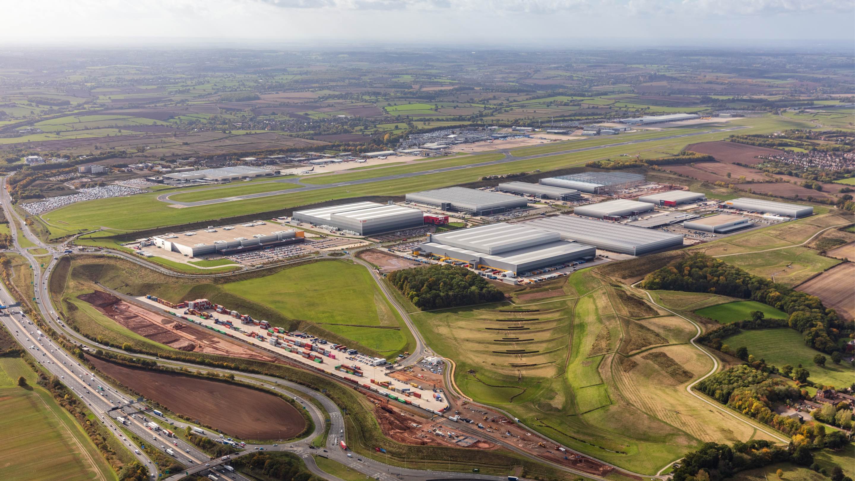
Aerial images can be used to provide another perspective to a site – aerials often very well illustrate a property’s layout, access and landscape features. Aerial images can date very quickly so attention should be paid to the accuracy and validity of the image. Quality can be an issue with aerial images, adding tones or dynamic colours can address this issue.
Details can add to the drama of a building and location, but they should always be in keeping with the overall style and design of any work.
Buildings should always have a sky that is in keeping with the general feel of the image. Buildings and the surround should always be clean and free from litter. Oil spills and any other visually distracting elements should be removed or minimised as much as possible in post-production. If actual changes to structures or street furniture is removed always keep in mind misrepresentation.
People photography
People are at the heart of our business and how we present them through imagery is important.

View rules and suggestions
Use natural “reportage” style photography where possible.
Never use anything that looks staged or cliched.
Do not use AI generated images, unless with prior approval by the SEGRO Marcoms team.
When photographing SEGRO people, you must follow the specific guidelines for this, found here.
Conceptual imagery
Conceptual imagery is used to convey and depict an idea or
proposition that will help differentiate between different
products and messages. They can be powerful visual aids when
used correctly.
There needs to be a very strong reason to use conceptual imagery
and it should be seen as a last alternative in the absence of
any other imagery or way of conveying a message. If conceptual
imagery has to be used then clip art and stock imagery is to
be avoided as it is widely available and, therefore, engenders
the risk of devaluing the SEGRO brand.

Do use conceptual imagery to articulate complex ideas or themes in a more engaging manner. The focus is on delivering information in a way that captures attention.
Do not use conceptual imagery in place of real asset photography when the purpose is to give a sense for what the space looks like. For example when showing the exterior / interior, location, general arrangement and so on.
Do not use AI generated images, unless with permission from the SEGRO Marcoms team.
Videography
All footage should be recorded at 4k where possible so that
it can be cropped to HD where required and ensure longevity
of source material.
Filming should be at standard 16:9 ratio and using a PAL recognised
format and framerate.
Any music used must be licenced or permitted for use in any channel
deployment. The use of the SEGRO logo will be determined by the
nature of the content and must be agreed with at brandguidelines@segro.com. If overlayed on footage, the original footage without a
logo layer must be made available.
As in stills photography, image release forms should be completed
for any footage that contains people's features or identifying
marks. SEGRO release forms are available on request.
For videos that have a predominantly internal audience, please follow the following suggestions
Interviewees must have their name and title on bottom left of the screen.
All subjects will be cropped to sit in the frame, reducing visual distractions.
All films must end with the SEGRO logo (to fade).
All graphics must comply to these guidelines.
Make sure all footage is captured in 4K wherever possible, using the standard 16:9 ratio.
Do not use stock footage unless for very specific purposes and otherwise cleared with brandguidelines@segro.com.
Use of music is encouraged, as long as proper licenses are obtained and its use fits within the overall tone of the video.
Examples in Action
Every piece of SEGRO collateral – brand or product – must conform with these guidelines. Below you will see a number of completed pieces that are good examples of how the guidelines work in action:
03
Visual Presentations
We use PowerPoint as the base for all visual presentations, unless agreed in advance with brandguidelines@segro.com.
When producing PowerPoint presentations, only use the agreed design and layout templates which can be accessed through SEGRO’s digital library (MySEGRO library), allowing access to all property/asset and people photography.

04
Digital
Digital encompasses a wide range of channels. As such, in many
cases design rules and restrictions have already been built into
the appropriate systems but for all others certain
considerations should be taken.
For typography and colourways: please see the
Identity section
in these guidelines. N.B. all website content should ideally
use predetermined CSS colours and not use HTML to create unauthorised
colour palettes. However, in certain circumstances and with permission
from the brandguidelines@segro.com, these can be overridden to meet
a specific campaign’s branding.
Imagery: all images must be sourced from SEGRO directly via the digital
library (MySEGRO library) or through the SEGRO Marcoms team. All imagery used on
digital channels should be formatted for the specific medium at
the specific dimensions and resolution. Photography must adhere to the ground rules contained within these guidelines.
SEGRO.com and other proprietary websites
SEGRO.com uses a defined style and form for our CMS templates and web assets / properties. Combining set visual styles and template modules, it creates a cohesive brand experience across all our websites and all micro-sections sit under the SEGRO.com umbrella site. The responsive grid is part of the design. Content uploaders must not deviate from the modules provided without approval and must not utilise unauthorised scripting under any circumstances.
Domain Strategy
All sites should be contained with SEGRO.com. In some cases, we do allow standalone sites as long as approved by brandguidelines@segro.com in advance. However, for marketing purposes, we can utilise 301 redirects for URLs to allow domains such as SEGRO.com/XXXXX and repoint to the specific page via the list of 301s that is managed in the CMS.
05
Signage
Overview
As the owner of many property assets, SEGRO commissions a lot of signage, both temporary (e.g. for leasing purposes) and permanent (e.g. for wayfinding reasons within an estate).
Below is a general summary and underlying principles of our wayfinding system for your reference. For more detailed, printable guidelines and plans see the links to the right.
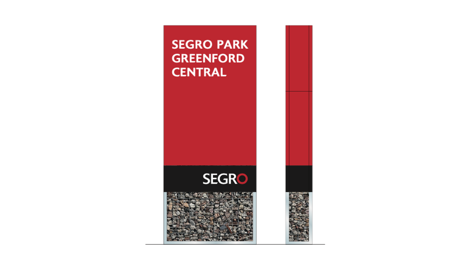
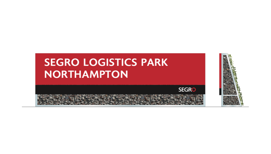
Naming Conventions
All our assets must follow one of four naming conventions as follows:
The above naming conventions apply to all SEGRO assets unless:
-
There is a compelling and unchangeable reason not to.
-
It is a Joint Venture (JV) situation where the JV partner insists on an alternative name.
-
We determine, at a later stage, to add another type if the need arises.
Acronyms
SPT
SEGRO Park Tottenham
SLPEMG
SEGRO Logistics Park East Midlands Gateway
STE
Slough Trading Estate
Detailed Guidelines
For more information, detailed plans and specifications, see the link below:
06
Building Livery
These are rules that must be adhered to in the creation of livery for all assets.
These rules are in effect from 1 January 2023. All usages of
any aspect of the SEGRO brandmark must conform with the SEGRO
Brand guidelines.
These rules replace any previous versions that deals with the livery
on SEGRO assets, either fully or part owned or assets of a joint
venture/partnership involving SEGRO.
Rules
Development pipeline
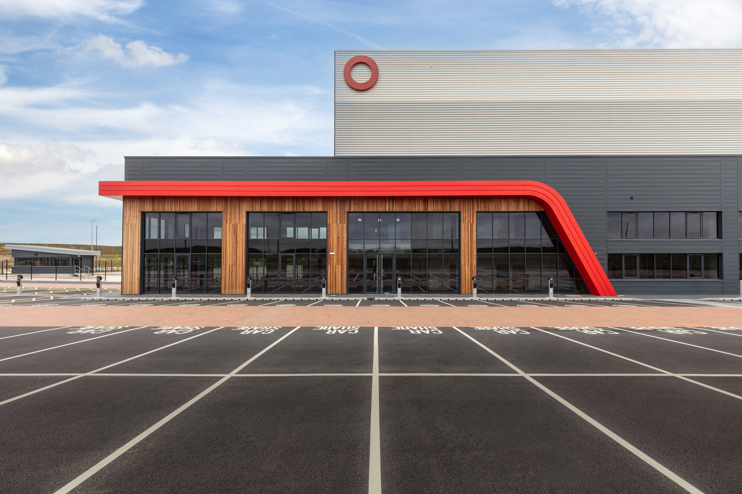
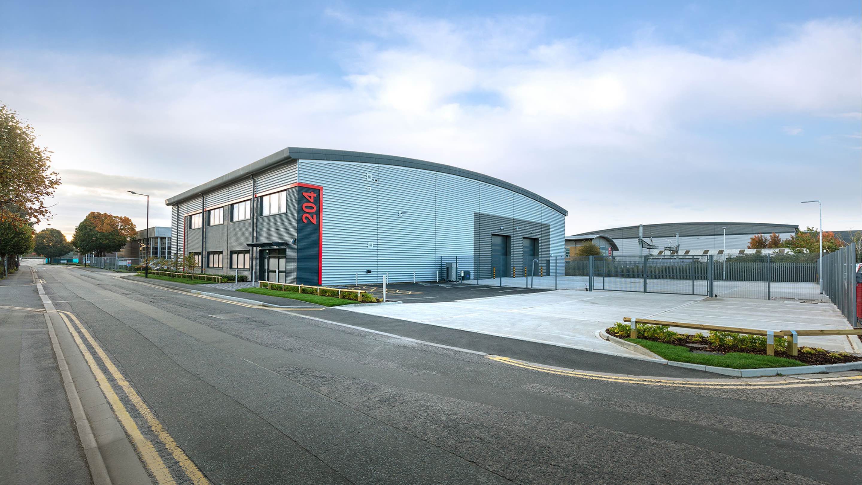
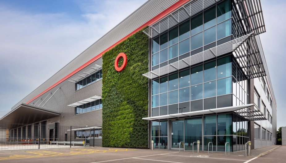
For a single building: on the fascia of the building (preferably on the upper right-hand side)* must display at least one full “SEGRO” or, if not permissible, then one red “O”.
For all estates (i.e. a development of more than one building, irrespective of use type): must have a “SEGRO” (or “O” if “SEGRO” not permissible) on the fascia of the most visible building on the estate, preferably on the upper right-hand side . For every other building on the estate, each must display at least one single red “O” (preferably on the upper right-hand side).
The “SEGRO” or “O” display must be illuminated.*
All properties must feature an element of SEGRO Red on the exterior of the building, in addition to the “SEGRO” or “O”. All properties differ, so there is no definitive guide as to specifically what the red element should consist of but, as a rule of thumb, the bigger the property, the greater the amount of red. As a guide there must be sufficient SEGRO Red colour (see definitions below ,– point 10) to be visible from 50m but no less than 5% and, preferably, 10% of any single facade should feature SEGRO Red.*
*subject to planning permission granted.
Standing Stock
Within 12 months of a lease event (i.e a letting, rent review or expiry):
For a single building: must display at least one full “SEGRO” or, if not permissible, then one red “O” on the fascia of the building, preferably on the upper right-hand side.*
For all estates (i.e. a development of more than one building, irrespective of use type): must have a “SEGRO” (or “O” if “SEGRO” not permissible) on the fascia of the most visible building on the estate, preferably on the upper right-hand side*. For every other building on the estate, each must display at least one single red “O” (preferably on the upper right-hand side.*
The “SEGRO” or “O” display must be illuminated.*
For refurbishments that are termed “substantial” (i.e. more than 50% of replacement costs): they must feature an element of SEGRO Red on the exterior of the building, in addition to the “SEGRO” or “O”. All properties differ, so there is no definitive guide as to specifically what the red element should consist of but, as a rule of thumb, the bigger the property, the greater the amount of red. As a guide there must be sufficient SEGRO Red colour (see definitions below – point 10) to be visible from 50m but no less than 5% and, preferably, 10% of any single facade should feature SEGRO Red.*
*subject to planning permission granted.
New acquisitions
(i.e. existing buildings) Within 12 months of acquisition:
For a single building: must display at least one full “SEGRO” or, if not permissible, then one red “O” on the fascia of the building, preferably on the upper right-hand side.*
For all estates (i.e. a development of more than one building, irrespective of use type): must have a “SEGRO” (or “O” if “SEGRO” not permissible) on the fascia of the most visible building on the estate, preferably on the upper right-hand side*. For every other building on the estate, each must display at least one single red “O” (preferably on the upper right-hand side).*
The “SEGRO” or “O” display must be illuminated.*
For refurbishments to new acquisitions that are termed “substantial” (i.e. more than 50% of replacement costs): they must feature an element of SEGRO Red on the exterior of the building, in addition to the “SEGRO” or “O”. All properties differ, so there is no definitive guide as to specifically what the red element should consist of but, as a rule of thumb, the bigger the property, the greater the amount of red. As a guide there must be sufficient SEGRO red colour (see definitions below – point 10) to be visible from 50m but no less than 5% and, preferably, 10% of any single facade should feature SEGRO red.*
*subject to planning permission granted.
Exception in Poland
For buildings in Poland, the preference is to have “SEGRO” but if that is not permissible, two black “O”s and one red “O” should be used instead (n.b. an “O” in Poland denotes a womens’ toilet).*
* subject to planning permission granted.
Livery for JV/Partnership assets
SEGRO branding should, where possible, take preference in JV or partnership situations. As such these rules should be adhered to.
When we sell a building
It must be written in to the legal contract that, within three months of the completion of the sale, all SEGRO branding must be removed from the building/estate.
Freehold/turn-key sales
These properties are exempt from these rules and should not feature any SEGRO branding.
Pre-agreed identified sales
Future development projects which are earmarked as a sale in the current MTP are to be excluded from these rules.
Customer branding
We will only permit customer branding on our assets IF this has been agreed by brandguidelines@segro.com .
Resources
Here you will find everything you need to create SEGRO branded assets.
If you run into any issues with the files, please get in touch with our marketing team.
Downloads
Image Repository
You’ll find a comprehensive database of our corporate and asset imagery at the below link. For any specific requests or to consult on commissioned photography, please get in touch with our marketing team.
Access the repository